Showing posts with label credit union branding campaign. Show all posts

Tuesday, February 15, 2011

Getting Animated

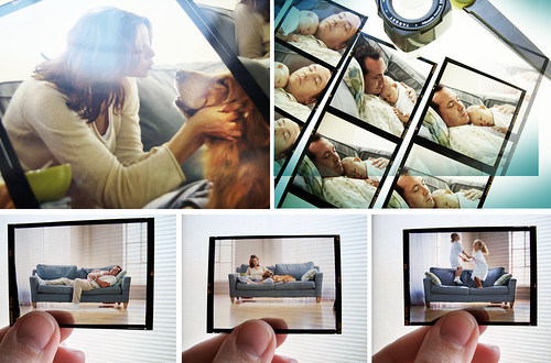
I like a film shoot as much as the next gal. Hello? Craft service. Yum. And speaking of craft. I love crafting an emotional connection with the viewer by capturing "real life" meets "what-we-wish-life-really-were" moments that you get from shooting a true moving picture.

TFCUPhotos

Film shoots are especially fun (fun meaning unpredictable) if there are dogs or babies involved. TFCU always includes at least one if not both. But they are so worth it in the end. Kleenex please.
BelvoirAmarilloAllegiance

But we've also created several animated videos for other credit unions like, Belvoir FCU, Amarillo FCU and Allegiance FCU

So why does this creative director think the animated approach is also a great alternative for credit unions?

1. You can stretch a television production budget (get more bang for your buck.. and yes, us creatives care about your budget)

2. Create an affordable (yes, we know that word, too) video for an internal launch or for branch multimedia and website play (even if you don't do TV placement)

3. Retain a high quality feel (your spot is playing right next to a national one and the viewer doesn't feel like yours is the "homegrown" commercial)

4. The visuals translate great online, where video is quickly becoming a must-have (smaller screens = me like pretty pictures)

5. Promote products with "pop" to get a short-term results boost as a balance to your overall long-term branding (rather than trying to clutter your awareness messaging with salesy offers)


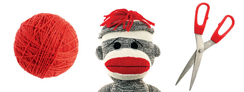
And even though you might think animation equals childish. Think again. And ignore the sock monkey below for just a second because it sort of negates my point. But animation have to mean cartoon. Set into motion photos, type, colors, illustrations and combine them with that just-the-right voice and that I'll-know-it's-right-when-I-hear-it music, and you begin to emote a lively, or a stirring, or even quirky (now enter sock monkey) moving message.
NGCUObjects

So as just static images, you ask "what the heck does a sock monkey have to do with getting a credit card?"


But set it into motion, and this "un-strings" attached credit card spot drives home the point. This is the third of a series of videos we've created for Northwest Georgia Credit Union, from their initial brand launch to a summer auto loan promotion.

ABNBObjects

These objects alone might look like a study in yellow...


But they actually represent the three pillars "open," "honest" and "hardworking" of ABNB Federal Credit Union's new brand.
LaCapObjects

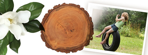
And who says an animated spot can't be warm, sincere – or rooted in something substantial?


Voice and music are the most compelling ways to bring a story to life, like we did for LaCapitol Federal Credit Union when they redefined their brand across the state of Louisiana.

And video doesn't just have to mean television. The ABNB and La Cap videos are also a great example of videos that were created for internal launches to employees and staff, that were later were more easily translated into shorter tv spots when they were ready to roll out their messaging to the greater community.

Tuesday, December 7, 2010

Open. Honest. Hardrocking: Credit Union Internal Rebrand Launch

ABNB Federal Credit Union is a progressive, people-friendly credit union out of Virginia that prides itself on being open, honest, and hardworking – and they needed a platform that would reflect that.

OpenHonestDetail

BrandBoardDuo

And that's where Third Degree came in. Ta-da!

ABNB whole-heartedly embraced their new look, and wanted to make sure their employees felt the love before unveiling it to the rest of the world. Smart. They launched the brand internally first, and made a day of it!

We made these cool internal culture books for each of their employees. They tell the ABNB story and introduce everyone to all the upcoming awesomeness.

BrandBook1

"Better than a bank" was ABNB's previous tagline. But we thought we could make it... well... better.

BrandBook2

BrandBook3

BrandBook4

ABNB was actually considering a possible name change as part of the rebrand. But decided to embrace telling their story versus changing out the sign on the door.

"What ABNB Stands For Today: So while Amphibious Based Naval Base has come and gone, the acronym, ABNB, is here to stay. Why? Because it has come to stand for so much more. Our employees sometimes joke it stands for Apples Bananas Nuts and Berries. But when they wear that ABNB logo, or say they work at ABNB, they know it's special. Perhaps Able, Brilliant, Nice, Brave are words more fitting of our credit union. But when it comes down to it, we have more than words to tell our story. At ABNB, our actions speak volumes."

ABNB HQWrap

BranchWrap

ABNB had their corporate headquarters wrapped and lightpole-banner-ed out to surprise the employees for the internal launch event. They've since wrapped all 13 of their branches as well.

EmpRally1

The all-staff event included ABNB VPs leading skits, sharing stories and singing songs to get everyone excited about the new brand. Rock on.

EmpRally2

When there's fake mustaches, you know it's serious.

MixCD

And each employee left with a small gift (branded,of course ) as well as a homemade mixed CD from their CEO to help express... well, his feeling, naturally.


Of course, never underestimate the power of video to bring an idea to life. The brand video was played at the internal launch, as well, and has since become the platform for a series of spots, as the brand is now in the external phase of it's launch, with television, radio, in-branch signage, merchandising, video and web. So ABNB can let the rest of the world know exactly how open, honest and hardworking they really are.

Friday, June 25, 2010

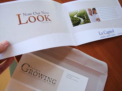
La Cap's New Look

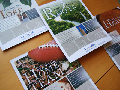
We've been busy launching a new brand in Louisiana lately. La Capitol (but all the cool people call them La Cap) is a statewide credit union that came to Third Degree for some branding love.

LaCapBrandBoards

This credit union is so rooted in culture and community, that we created a look and feel for them that would organically tie them to not only the physical traits of their state but also the Louisiana state-of-mind.

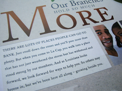
LaCapCopyDetail

Local, local, local... and credit union differentiation from banks are the main themes you'll find woven into all the messaging.


We created a brand video seen here, and a condensed version for television. Probably one of the more sincere and steeped-in-tradition animated videos we've done in a long time. Usually our animated videos (which are a great way to get a high-quality feel for a modest budget) tend to be bright and "poppy," with like toy cars or happy little wrenches. But this video for La Cap shows you can use the same execution to tap into a more heartfelt emotion as well.

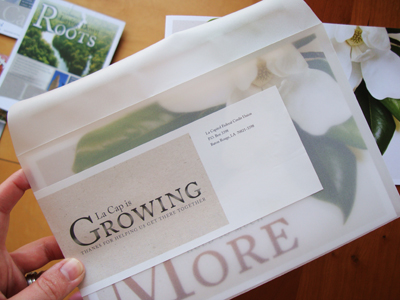
LaCapMailer

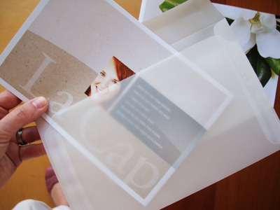
LaCapMailer2

LaCapMailer3

Getting the employees on the bandwagon is so important it's not even funny. So part of the soft launch of the brand included a variable, specialty mailer sent to each employees home (that's right, their home), not just tacked to the break room wall. Not that break room walls aren't a very handy medium. But this kind of piece makes everyone feel "the love"... La Cap style.

Wednesday, April 21, 2010

Credit Union Takes A Branding "U" Turn

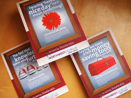
I just have to share this recent branding we did for a bright and plucky credit union in Rome, Georgia. Northwest Georgia Credit Union is a little bit down-home and a little bit bold.

NGCUBrandBoards

So our discovery workshop a few months back revealed that Northwest just really wanted their outsides to match their insides. Not a bad problem to have. They had some spirited ideas for sure, like the themeline: Un-banking. Unbelievable. But our tour of their offices revealed a softer, warmer, more cozy vibe (flowers, wooden framed artwork, family feel) than their new corporate looking logo and brassy tagline led us to believe.

So we meshed the two together, and voila came up with "a little bit country, a little bit rock n' roll" solution. Not really a u-turn at all, more like a bit of crafty mixology.

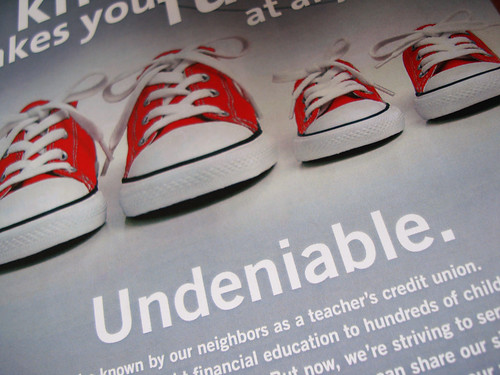
NGCUSneakers

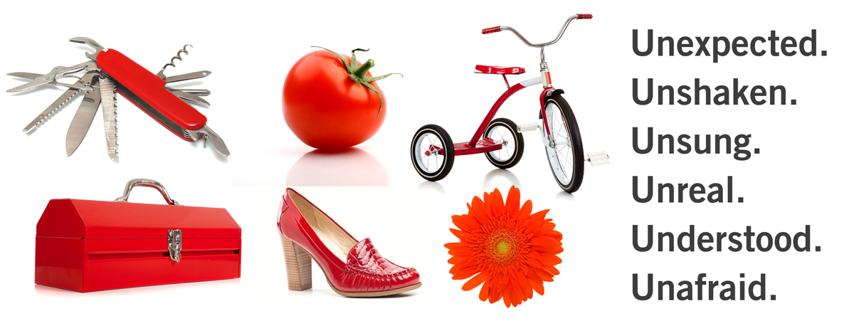
NGCUPlatformElements

But of course we just had to have fun with the "u" words... I mean, how could we resist, right? We also gave them a visual platform based on these fun red objects and words that they could take and build on in the future...

NGCUWeb

... like updating their web site themselves (but still consistent, no?), basically giving them some building blocks to create everything from touchy-feely branding to zing-packed promotions.


Although I think the brand TV spot we created for them was pretty zingy and brandy (yes, that's the new hot advertising term for it.. brandy). The puppet-show-inspired animated approach ended up just right: un-corporate, un-stuffy, and a little bit unexpected.

Friday, March 26, 2010

TFCU Get Back To You

I still get excited when I'm watching one of my favorite shows (The Office) or one of my guilty pleasures (American Idol), and then during the break I unexpectedly see one of the commercials we created. It's sort of like when you are out shopping or at a restaurant and you don't realize there's a mirror on the wall beside you, and then you accidentally see yourself, and for just a moment you thought it was another person, but then when you realize it's your reflection you feel sort of like... "hi me."

TFCU GBTU-0429

That's how I feel when I see these new TFCU television spots.

You can scroll to the end of this post to watch the video.

TFCU GBTU-1542

The theme is "get back to you." And that's literally what we did. We just set up these little scenarios where people did stuff that you just "do." Either back when you were a kid or still today.

TFCU GBTU-1550

The house we found to shoot in surprisingly had this piano, so we just decided to add in a Chopsticks scene, and it is one of my favorites. Maybe because I took piano lessons from age six up to highschool. Sometimes when we're feeling goofy at Christmas or on a random weekend at my parents' house, I'll start playing "Fame" on the front-room piano, and me and my sister scream-sing it.

TFCU GBTU-0955

These were our actor sisters. They probably would have scream-sung any 70's TV themesong we asked them to. They were so much fun and one of them even sent us like a pie or something to Third Degree as a thank you a few days after the shoot. Yes, bribery with food will get you everywhere.

TFCU GBTU-1867

Bribery with a baby on a set... could go either way. Our director, David Stepp, just loooooves it when we put babies in our spots, you know, because they are so predictable and all. But I can't help it, I just got to have them babies. This cute one is the tot of one of our interns. We finally got him hooked up with some Teddy Grahams and he gave us the good stuff on camera. See, food bribery, it transcends all ages.

TFCU GBTU-2160

All in all, it was a wonderful shoot. Everything was super-duper planned out and art directed (I couldn't function any other way) down to a strict wardrobe color palette and a tight all-in-one-day shoot schedule, but we didn't really have any traditional scripts. We just set up these home movie style scenarios and crossed our fingers and started rolling. Some of them turned out so much better than we ever dreamed, and some, not so much. And some, like getting this little guy to keep that spoon on his nose... just took some double stick tape.


Tinker Federal Credit Union is great about letting us continue to evolve their branding, but still keep it feeling unmistakably "them." I know when we're creating something they and their members are really going to love, because it always feels like a lot of hard work, a lot of "eek, we've never done this before" (i.e., going completely off script, choreographing zombies, featuring talking thumbs, or constructing home made robots) but then, it also feels... a lot like play.

Wednesday, January 13, 2010

Paint By Numbers

I'm in Atlanta visiting our friends at Delta Community Credit Union. Great restaurants, good company... plus, I got to see one of their new number-themed commercials we just finished up for them on my TV at the hotel this morning!

TenTV

I never get to see their commercials "for real" because, well, duh, I live in Oklahoma City, and it never seems quite real until you see one of your spots during Project Runway or Top Chef, or in this case, the news. Which I only ever seem to watch when I'm in hotels or airports.

HotelPajama

Me. In my PJs. Watching the news (just because there aren't any reality shows on TV at 6:00 in the morning).


Director: David Stepp / Animator: Steve Jones / Audio: Lucky Dog / Photography: Simon Hurst

These TV spots were all about Ten Reasons to Switch in 2010 to Delta Community. These spots turned out so cool. We wanted to bring these numbers to life to create a memorable and optimistic new membership campaign for Delta Community for the new year (a fuzzy number five dog, a number three sonogram)...


Plus, it was as about as close as I could get to living out my lifelong dream to work for Sesame Street or Jim Henson. I mean, our big orange fuzzy number five was definitely muppet-worthy.

SuitcaseFont

This is Doug. He's the bad ass who constructed all these props for us back at his shop at Eaton Quade. He doesn't even flinch when we say, "can you make a giant number eight shrubbery for us?" Which is good, because then his cigar might fall out of the corner of his mouth. We think he should have a reality show about his shop, like American Chopper.

NumberShop

American Chopper with giant Fruit Loop colored numbers everywhere, that is!

PropShop

Actually color was a big deal when planning for this shoot. Kathleen was the master mind of all things fuzzy, paint sample chippy, paper leafy, etc...

WarholTest

Tons of planning went in to creating the props and the perfect color palette, from deciding to paint the studio "Decisive Yellow" as was named on the swatch, to buying lots of coordinating wardrobe for all the talent. And, of course, Kathleen also stood in as the model for the test shots.

NoHoopsAd

I know Delta Community is excited to kick off the new campaign.

CharlieFive

And I was excited to take home the fuzzy five (just for one night) to show my number one five-year old.