
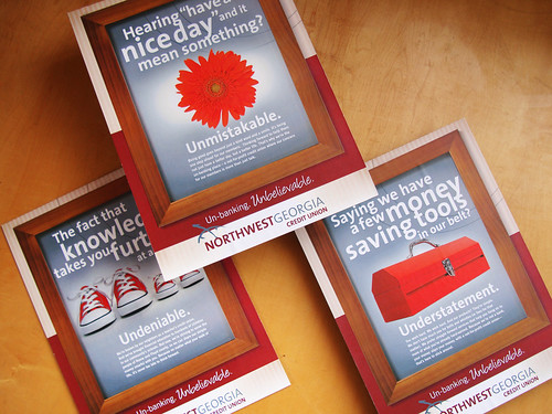
So our discovery workshop a few months back revealed that Northwest just really wanted their outsides to match their insides. Not a bad problem to have. They had some spirited ideas for sure, like the themeline: Un-banking. Unbelievable. But our tour of their offices revealed a softer, warmer, more cozy vibe (flowers, wooden framed artwork, family feel) than their new corporate looking logo and brassy tagline led us to believe.
So we meshed the two together, and voila came up with "a little bit country, a little bit rock n' roll" solution. Not really a u-turn at all, more like a bit of crafty mixology.
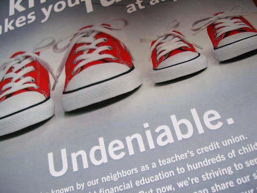
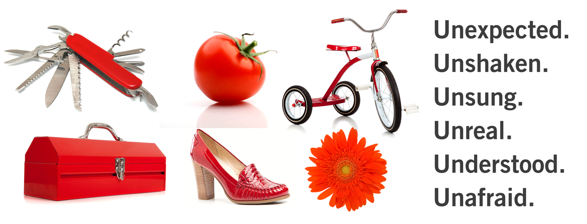
But of course we just had to have fun with the "u" words... I mean, how could we resist, right? We also gave them a visual platform based on these fun red objects and words that they could take and build on in the future...
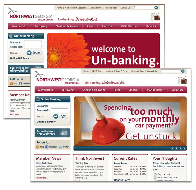
... like updating their web site themselves (but still consistent, no?), basically giving them some building blocks to create everything from touchy-feely branding to zing-packed promotions.
Although I think the brand TV spot we created for them was pretty zingy and brandy (yes, that's the new hot advertising term for it.. brandy). The puppet-show-inspired animated approach ended up just right: un-corporate, un-stuffy, and a little bit unexpected.

No comments:
Post a Comment