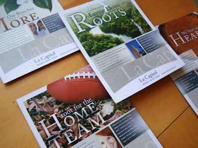
This credit union is so rooted in culture and community, that we created a look and feel for them that would organically tie them to not only the physical traits of their state but also the Louisiana state-of-mind.
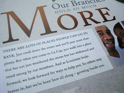
Local, local, local... and credit union differentiation from banks are the main themes you'll find woven into all the messaging.
We created a brand video seen here, and a condensed version for television. Probably one of the more sincere and steeped-in-tradition animated videos we've done in a long time. Usually our animated videos (which are a great way to get a high-quality feel for a modest budget) tend to be bright and "poppy," with like toy cars or happy little wrenches. But this video for La Cap shows you can use the same execution to tap into a more heartfelt emotion as well.
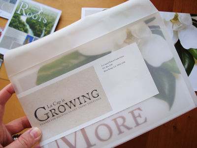
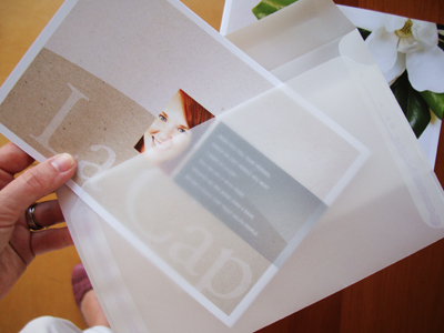
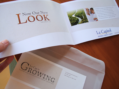
Getting the employees on the bandwagon is so important it's not even funny. So part of the soft launch of the brand included a variable, specialty mailer sent to each employees home (that's right, their home), not just tacked to the break room wall. Not that break room walls aren't a very handy medium. But this kind of piece makes everyone feel "the love"... La Cap style.



1 comment:
Love that the brand stays close to LA roots (and those vellum envelopes are beautiful!)
Post a Comment