
Film shoots are especially fun (fun meaning unpredictable) if there are dogs or babies involved. TFCU always includes at least one if not both. But they are so worth it in the end. Kleenex please.

But we've also created several animated videos for other credit unions like, Belvoir FCU, Amarillo FCU and Allegiance FCU
So why does this creative director think the animated approach is also a great alternative for credit unions?
1. You can stretch a television production budget (get more bang for your buck.. and yes, us creatives care about your budget)
2. Create an affordable (yes, we know that word, too) video for an internal launch or for branch multimedia and website play (even if you don't do TV placement)
3. Retain a high quality feel (your spot is playing right next to a national one and the viewer doesn't feel like yours is the "homegrown" commercial)
4. The visuals translate great online, where video is quickly becoming a must-have (smaller screens = me like pretty pictures)
5. Promote products with "pop" to get a short-term results boost as a balance to your overall long-term branding (rather than trying to clutter your awareness messaging with salesy offers)
And even though you might think animation equals childish. Think again. And ignore the sock monkey below for just a second because it sort of negates my point. But animation have to mean cartoon. Set into motion photos, type, colors, illustrations and combine them with that just-the-right voice and that I'll-know-it's-right-when-I-hear-it music, and you begin to emote a lively, or a stirring, or even quirky (now enter sock monkey) moving message.
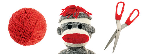
So as just static images, you ask "what the heck does a sock monkey have to do with getting a credit card?"
But set it into motion, and this "un-strings" attached credit card spot drives home the point. This is the third of a series of videos we've created for Northwest Georgia Credit Union, from their initial brand launch to a summer auto loan promotion.

These objects alone might look like a study in yellow...
But they actually represent the three pillars "open," "honest" and "hardworking" of ABNB Federal Credit Union's new brand.

And who says an animated spot can't be warm, sincere – or rooted in something substantial?
Voice and music are the most compelling ways to bring a story to life, like we did for LaCapitol Federal Credit Union when they redefined their brand across the state of Louisiana.
And video doesn't just have to mean television. The ABNB and La Cap videos are also a great example of videos that were created for internal launches to employees and staff, that were later were more easily translated into shorter tv spots when they were ready to roll out their messaging to the greater community.



No comments:
Post a Comment