But what was kind of funny is that they were both for regional rural health centers, Jackson County Memorial Hospital and Unity Health Center.
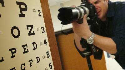
And, both shoots were booked with Simon Hurst, one of our favorite photographers from across the pond (that means he's English, like the Hugh Grant.... or Mr. Bean).
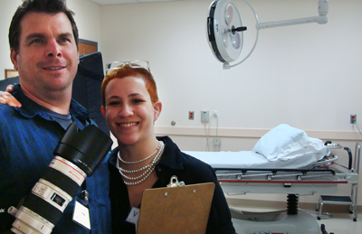
He calls Oklahoma home, now, though. It's not like we fly him in special-like all the way from England.
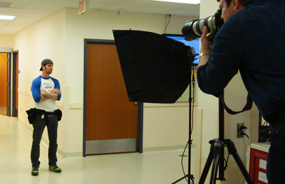
That's his photographer's assistant, Beau.
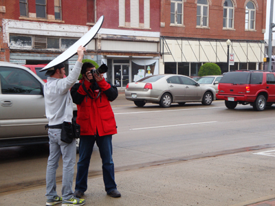
Beau is like a magician's sequined, smiling assistant. Except not smiling, and no sequins. But he does get all the glamorous jobs like keeping Simon and his camera dry in the rain.
This might be some lighting thing going on here, but I'm pretty sure it's makeshift umbrella duty.
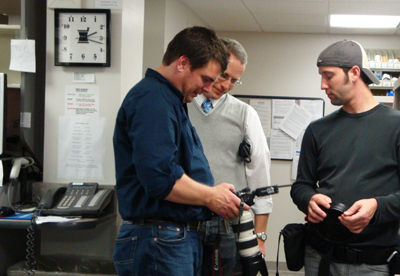
Beau probably has a lot more to say than he shares. As he watches our associate creative director Brian, consult with Simon, Beau's probably thinking we should try a different composition, or consider shooting our every day people with greater depth of field to exaggerate the concept of them playing a powerful role in their own healthcare.
Or he's wondering when we might break for lunch.
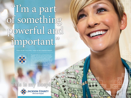
A lot of times we use stock photography for our executions, especially in the initial concepting phase. This is one of the brand platforms we just started for one of our newest clients, Jackson County Memorial Hospital. We'll continue to develop this brand into other messaging mediums like a web site redesign, annual report and an internal awareness initiative including an employee brand book. But we'll be replacing some of the stock photography with custom photography of real doctors, patients and members of the community.
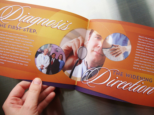
It's not unlike the brand we created for Unity a couple years back. The "it starts at the center," platform has been a springboard for outdoor, web, print and also internal outreach – like a brand video they shared with all the staff and community members at a town hall-style launch of the new Unity look and feel. We ended up using a combination of stock and "real people" photography in the final pieces we created for them.
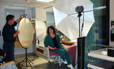
It's always an unpredictable undertaking shooting real staff and patients. Simon is really great about putting them all at ease, and they usually find his British accent incredibly charming. Because, unless you're like our art director Kathleen, most regular people don't necessarily run to fling themselves in front of the camera.
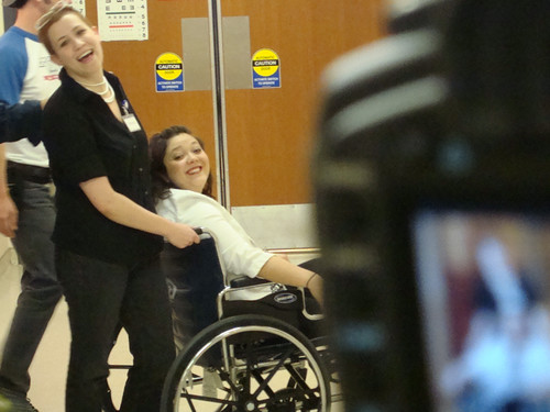
Although it's always pretty easy to find Third Degree team members who are willing to act as stand-ins while we find our best shot.
Okay, technically since our account coordinator Felina is expecting, it's somewhat appropriate for her to be pushed in a wheelchair. But our designer, Liz, is definitely not qualified to be her caregiver. Although I have a suspicion she's no stranger to playing doctor.


No comments:
Post a Comment