Universal Appeal
This is a set of collaterals that Kathleen and Kande just recently completed for OCU. I think they look really modern and competitive. OCU attracts students from around the world, so having a global appeal was a big deal.

Campus Collage
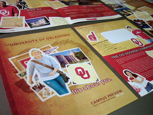
This is the theme that Phillip and I developed for the University of Oklahomas recruitment efforts a couple years back. This first redesign set the tone for the next couple years, which we helped them evolve. This campaign won a gold Addy for us that year as a mixed media campaign, which is cool, because most mixed media campaigns that win include "big" mediums like broadcast like TV or radio, but ours competed with just a mix of different types of well-crafted collaterals.

Doodles and Details
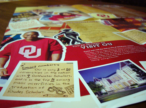
This was a seriously layered approach, tons of tidbits of information, handwritten notes, little objects and photos. It sort of had the feel of a scrapbook or common room bulletin board in a dorm.

Home Page
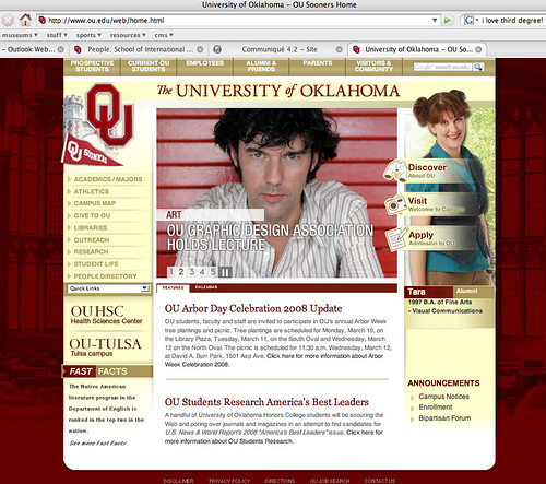
The gals and guys at OU web wanted us to help them create a new look for their web site, too. This is a huge project for them over there, and they are all about getting their site as cohesive and comprehensive as a major university's should be. So, as they continue to take that online presence to the next level, we're just glad to have had a part in influencing the look and feel.
Plus, I got to be featured on the web site as an alumn (not the brooding guy with the mysterious hair, the smiley girl with the not-so-mysterious hair.)


1 comment:
I have the biggest crush on Stefan Sagmeister (the dark brooding man on that web page).
Post a Comment