I realize that most people probably don't have this same obsession. But I think most people agree they love food... you know, the real kind. So it's for more than self-indulgent reasons that I can say I love the food themed promotion we recently launched for MECU (Motorola Employees Credit Union) who are based outside of Chicago, IL.
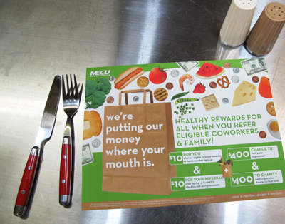
MECU exists to be the go-to financial institution for employees or family members of employees of Motorola. So they rely less on mass media and more on member-focused marketing. When they asked us to come up with a new take on a member referral program, we came up with a yummy solution: a chance for a lucky member to win $400 in groceries for themselves and the person they get to sign up to be a MECU-er just like them.
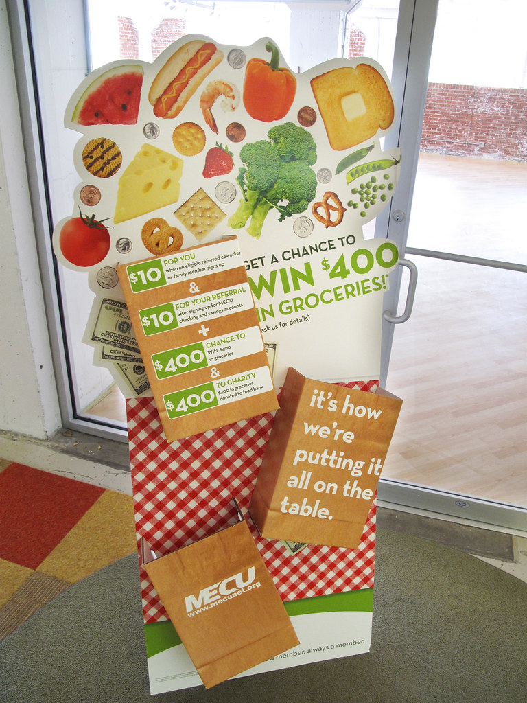
Since their service centers are one of the primary places we'd be reaching members, we wanted to make an instant impression. We created an oversized standee that could be further elaborated upon by service center managers who are encouraged to fill the three dimensional "sacks" with real groceries and arrange real paper bags also filled with groceries around the base of the standees.
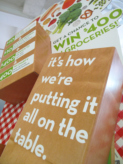
We wanted to get really dynamic with all the components of the campaign, so the die cuts and three dimensional details just helped give everything that extra pop...
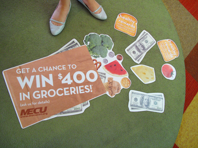
... like floor clings (actually heavy traffic removable carpet clings) made to look like toppled bags of groceries on branch floors...
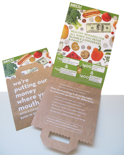
... and a die cut direct mailer that carries out the paper sack theme.
But, our theme was more than just a food fixation. It was really based on the idea of MECU providing for their members like they've always had. Putting groceries on the table is something that is fundamentally family and financially oriented. With messaging positioning MECU as a not-for-profit alternative to big banks, we're helping them put their difference out there "on the table" for their members to remember and share.
And there's nothing fake about that.


5 comments:
That die cut direct mailer rocks.
; )
Thanks Heritage! As a matter of fact... I think perhaps you printed it! Ha.
This makes me hungry. You need a blueberry client.
Nice work. Can I please share it at The Financial Brand?
Sure Jeffry. That would be great.
Tara
Post a Comment