People People
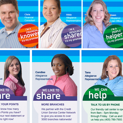
For example, they always use their own employees to tell their story, featuring them in all their materials. Here is a messaging series we created for their allegiancecu.org site to help them position themselves as really being a knowledgable resource for their members. Not only did they embrace it, but they made their own buttons that each of their front-line employees wear in the branches, deciding if they want to be a "helper," a "knower" or a "sharer" depending on their own personality.
A Silly/Serious Promotion
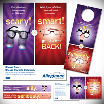
This is the most recent checking promotion we themed for them. Third Degree created the concept, and then designed elements like teller mats, doorhangers, direct mail and web banners. The promotion got great results, just between November and December Allegiance grew $3.8 million in checking accounts and now have over 800 Rewards Checking accounts.
Window Shopping
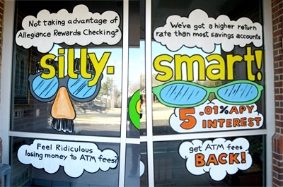
Of course we can't take all the credit. We didn't even know Allegiance had hired a window artist to come in to paint these whimsical branch-front windows to feature the promotion, until Brett, who designed the smart/silly campaign happened to see them driving by. Could they have had Third Degree design and produce a more graphic, professional window-cling? Sure. Would a more conservative or sophisticated campaign been sort of jacked up by trying to recreate it with a cartoonish window-painting style? Uh... yeah. But for this fun, lively, friendly promotion, it was a perfect fit, and a really economical solution.
Making "Spectacles" of Ourselves
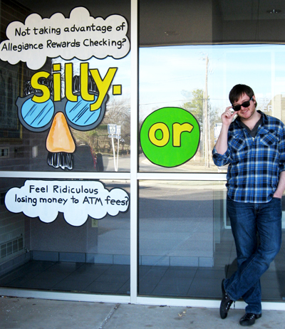
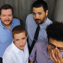
That's Brett. And that is one clever idea we can't even take credit for. Dang! However, that doesn't stop us from posing in front of it. Nice shades.


2 comments:
Plugged your firm and this project at The Financial Brand today:
http://thefinancialbrand.com/2009/03/05/allegiance-credit-union/
Thanks Jeffry! Your spreading-the-word spirit and enthusiasm for credit unions is always appreciated by us. Tara
Post a Comment