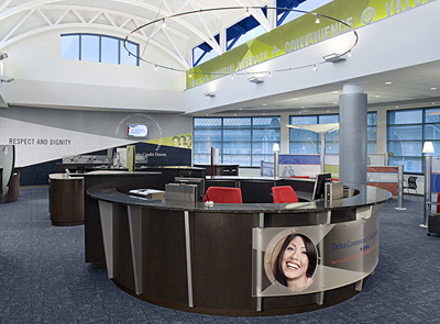
They have really fantastic branches. The design is really modern, but the way the flow is set up is really welcoming and organic.
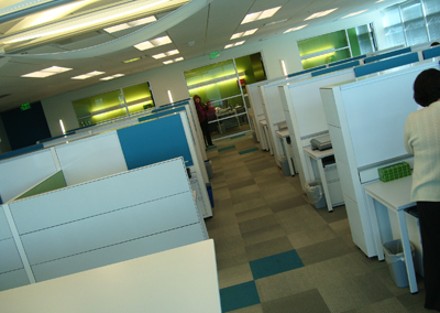
So I shouldn't have been surprised that their brand new internal offices (they just moved in a few weeks ago) would be equally pages-of-Dwell-magazine worthy.
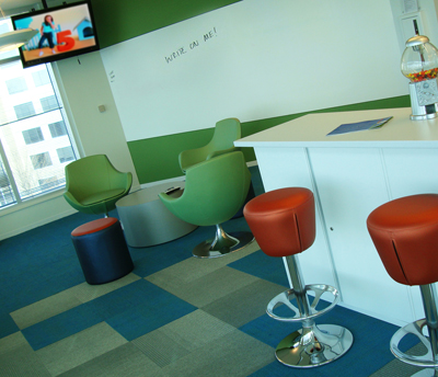
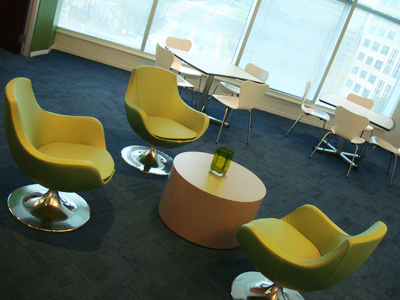
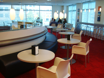
All of their spaces reflect Delta Community's progressive but personable credit union vibe. But the marketing department especially had its own creative flair going on.
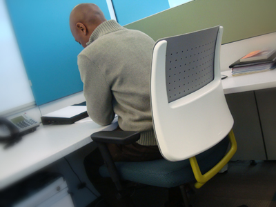
"My what a cool chair you have, Ollie."
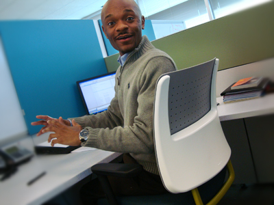
"Why this old thing? Shucks."
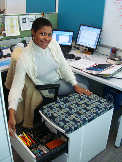
"Do sit down. My file cabinet is disguised as a cushiony bench. I am mysterious and have secrets that way."

Look there's Simon. Aw. He found a new home.
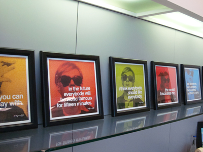
Right next to Andy. How cute.
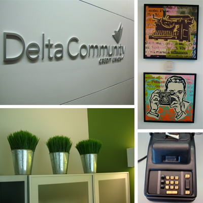
What's so cool about the marketing team's space (beside that fact that VP of Marketing, Mary Olsen practically designed it herself single-handedly!!?) is that it creates this sense that the marketing team really is a culture within a culture at Delta Community.
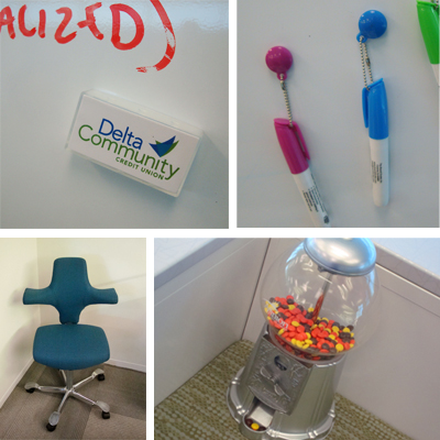
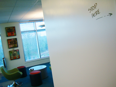
The national HOW Design Conference has whole sessions, heck, whole conferences, to help creatives who work inhouse find creative inspiration. So it's certainly unique to find such a fresh inhouse space.
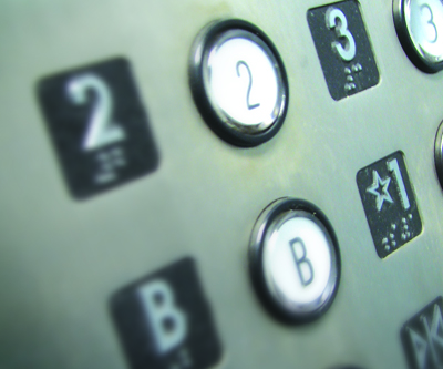
Alas, now I am back in the OKC. I cannot complain, Third Degree has a fantastic lofty, warehouse style office space. But I bet Delta Community's elevator actually works.
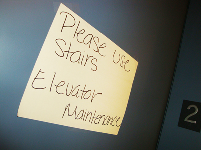
It was like a welcome home sign really. Sigh.
Next time I'm in "Hot"lanta visiting the Delta crew, I'll be sure to ride the elevator up and down just a few more times for the luxury of it all.


No comments:
Post a Comment