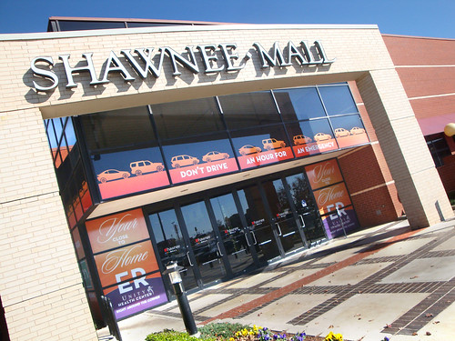
Our most recent mall attack is an ER campaign for a regional hospital, Unity Health Center. While we'd done our fair share of outdoor for this small-town-provider trying to keep their community close to home vs. trekking an hour to the big city – the mall had been an untapped territory for getting out the word.
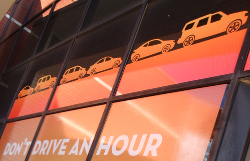
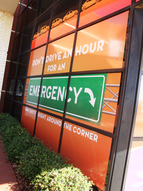
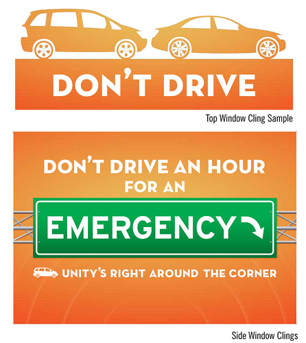
It takes a lot of planning and clever use of space to get the best impact out of a wrap like this. You don't want it to look like a flying giant banner accidentally smacked into to the front of the building and just stuck there.
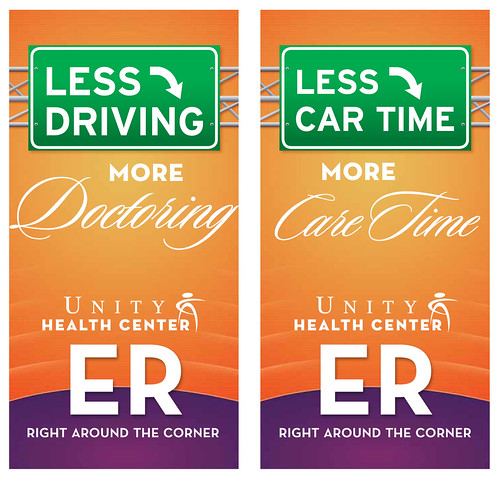
If you asked our media planners (after bribing them with soft pretzels or Gap gift cards of course) to tell you the top four reasons why they recommend mall placement for your messaging, they'd say:
1. It's a perfect example of taking your media message to where people are, as opposed to making them come to you.
2. Like outdoor, but people aren't whizzing past at 60 mph-- they have more time to take the message in.
3. A great medium to tackle that ever elusive tween/teen audience. Several recent studies have been done about the effectiveness of mall advertising against teens.
4. It is a great way to target geographically. If your market potential is several neighborhoods, as opposed to an entire DMA, seek out your local mall. For the most part, people shop, close to where they live or work.
It's why we've "gone to the mall" for clients like Planned Parenthood where we've wrapped unused storefronts strategically located next to family rest & play areas, Buck The Norm with a debt-wise message right around holiday shopping time, and ACOG Clean Air messaging with a giant suspended "square of clean air" over the atrium-style food court and square blue-sky floor clings leading up to all the escalators.

ACOG "Get Square" including mall installation.
Planned Parenthood mall storefront wraps.
Buck The Norm mall banners.



No comments:
Post a Comment